Data visualization has become crucial in understanding the underlying relationships in the expansive and complex data sets of today’s big data environment. Essentially, data visualization is translating information into a visual format that is intended to convey a message or elucidate meaning from this information. When done well, these visual representations are not just aesthetically pleasing—they provide a story that is more compelling than text and allow the viewer to see the data in a new context that can be transformative to their understanding of a problem.
The Beginnings of Data Visualization
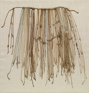
Humans have long been sharing information with one another and making sense of the world through the creation of data visualizations. Many cultures have had distinctive visual information systems. For example, Neolithic cultures in the Near East used a variety of clay tokens to encode and communicate economic information beginning around 7500 BCE.1 The Inka used a system of knots on strings, called khipu, to record and transfer messages throughout their expansive empire,2 while knowledge about the location of islands, currents, and tides in the sea was shared through stick charts by people from the Marshall Islands.3
 |
 |
|
|
An Inka period (15th-16th century) khipu displayed at the Cleveland Museum of Art2 |
A Marshallese stick chart on display at the Majuro Museum4 |
Human Brains Evolved to Process Images
The superior ability to recognize and interpret patterns when processing images is one of the quintessential characteristics of the human brain.5 This specialization can be seen in the structure of our brains, as more than half of the brain’s surface is dedicated to decoding this visual information.6 In fact, the human brain is so good at interpreting visual information that it can identify the meaning of images seen for as little as 13 milliseconds.7 Because our brains are specially wired for visual stimulus, messages created to activate this capacity may be uniquely effective.
Images Improve Education: Increasing the Speed, Accuracy, and Recall of Information
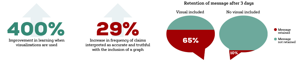
Visual elements in educational material decrease the time needed to grasp a complex topic. When visualizations are used, learning has been shown to improve by as much as 400% over the use of words alone.8 Graphics impact our interpretation as well. In a study performed at Cornell University, scientific claims were found to be interpreted as accurate and truthful 29% more often after the addition of a simple graph to accompany the statement.9 Images also improve our ability to remember information presented. When we solely hear a piece of information, we retain 10% of the message 3 days later. That maintenance increases to 65% when the information contains a picture.10 Visual imagery in learning allows for complex stories to be precisely and memorably communicated in less time. Speed, accuracy, and memorability are particularly important when creating materials for members of the medical community, who are increasingly under further time constraints and regularly make treatment decisions relying on their knowledge base.
The Evolution of Data Visualization
As the technology we use to gather and represent information evolves, so do the possibilities of how we can use data visualizations to drive our stories. Before the advent of the internet, data visualizations were constrained to static images of charts and graphs printed in journals, newspapers, or books. Today, we can create dynamic visuals for a wide range of digital communications that have movement, interactivity, and the power to become an experience instead of just an image on a page.
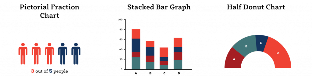
Most of us are familiar with common data visualizations like bar graphs, line graphs, and donut charts. Scatter plots, percentage bars, and pictorial fraction charts are some other visual representations that are frequently encountered. However, the possibilities reach so much further with options like mind maps, packed circle charts, jitter plots, bubble timelines, alluvial diagrams, and clustered force layouts, just to name a few.11

The next generation of visualizations includes the ability to reorganize and investigate the information being presented within them. This adaptability aligns closely with many of the key principles in adult learning theory. Adult learners prefer to be autonomous, form relationships building upon their past experiences, and see how the information presented is useful to them.12 Through the self-exploration of data, these learners can approach the information from their unique experiences and draw upon their knowledge to gain a deeper understanding of what is being presented, finding patterns and relationships within the information. Adult learners can approach the data fueled by their own questions and needs, and this format automatically tailors learning to what is relevant to them and their interests.
Type 2 Diabetes (T2D) Data Through a New Lens
T2D is a complex disease with many factors contributing to its development and successful treatment.13 Finding new ways to present the enormous amount of data related to T2D allows viewers to find insights by combining many variables into a single figure, whereas traditional graphs can show only 2 variables at once. These visuals can also help to highlight relationships, removing some of the noise that can drown out key messages. This is well demonstrated by the first figure below, which communicates the percentage of adults with T2D and the percentage of adults with T2D and obesity in the 10 states with the highest percentage of adults with T2D for the years 2002 through 2018. The way the figure updates the order of the states shown at each interval allows the viewer to observe patterns while simultaneously providing a snapshot of the top 10 states for the years displayed.
In the second figure, the state T2D prevalence data is presented in a different way. All 50 states are now shown as bubbles proportionate to the number of individuals diagnosed with T2D in each state. Hovering over a bubble allows the viewer to uncover the represented state and the total number of individuals diagnosed with T2D in that state. By selecting the buttons below the image, the viewer can group the data by variables such as gender and age to observe how these parameters combine to create the overall prevalence. One can easily imagine how this format could be a compelling way of describing any complex population. For example, the age, sex, race, biologic-naive status, biomarkers, or any other data relevant to a study population could be elegantly communicated in this format.
Different Approaches to Data Visualization
Edward Tufte
According to Edward Tufte, a statistician and pioneer of data visualization, visualizations are like maps: “When there’s so much data, the only way to show it is to show it.” He believes in using visuals to display complex data sets, emphasizing that the key is to remember the visual is for the audience, not the person creating it. His philosophy is to show as much detail as possible but avoid adding anything superfluous or flashy that could detract from the data or impede learning. The goal is for the learner to focus on the content, and the more content presented, the more credibility one has.15
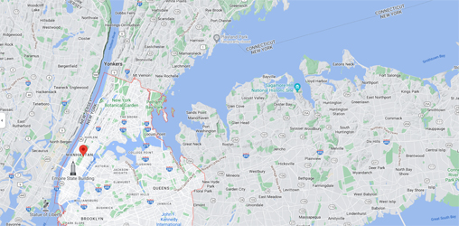
According to Tufte, Google Maps is a great example of a single space that displays multiple layers of data. The format is clean and straightforward but extremely content rich. The user can easily edit and choose what to look at, which creates a personalized experience every time.15
 |
 |
|
A Google Maps image demonstrates the many layers of data that are depicted, including streets, parks, businesses, churches, and bodies of water.15 |
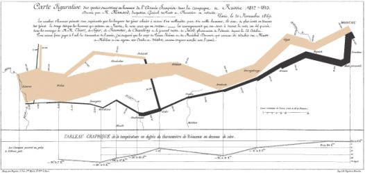
A map that Tufte calls “probably the best statistical graph ever drawn,” which shows Napoleon’s march into Russia. Created by Charles Joseph Minard, the graphic allows the viewer to understand the distance traveled and the immense losses experienced on the way to Moscow (tan band) and back to the Polish border (black band) by changing the size of the band to reflect the size of the army.17 |
Giorgia Lupi
Another approach is to see data as art. When the humanity behind the numbers comes to the forefront, the information has the potential to be more relatable to learners. Information designer Giorgia Lupi strives to produce visualizations that are functional, yet artistic. In her words, “…I think beauty is a very powerful trigger for people to get interested.” Her goal is to make data more digestible as information becomes available.18
 |
 |
|
|
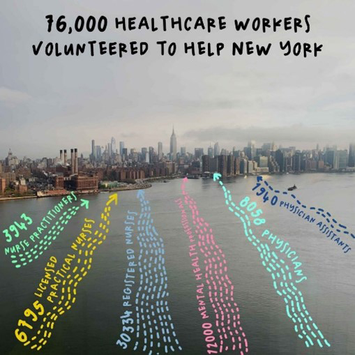
The image on the left shows data about the healthcare workers who helped support New York during the start of the COVID-19 pandemic in March 2020. The data are transposed over the East River and are shown approaching the Manhattan skyline.19 |
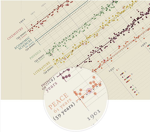
Lupi and the Accurat team transformed data on the 6 Nobel Prize categories, such as the year of the award and the age of the recipient, into elegant line figures inspired by musical scores.20 |
Our Role at FORCE
At FORCE, our mission is to bring science to life. We specialize in using data visualizations to accomplish this mission and are proud to offer customized services to each client. Our Scientific Innovation and Creative & Technology Studios teams partner to understand the data presented, conceptualize the best representation of the data, and create exceptional visualizations that enhance the storytelling experience.
No matter the audience, budget, medium, or message, we are confident that our data visualizations bring science to life by telling stories through data in new and innovative ways.
References
Please provide a valid e-mail address below to receive updates when new Blog content is available.
